
This was a 1 month-long project where I designed an enrollment form for web and mobile to help students sign up for the Pathrise program. The team consisted of myself, our growth team, and our lead engineer. This case study focuses on design execution and AB testing.
TLDR
Our growth team established parameters for a new enrollment form
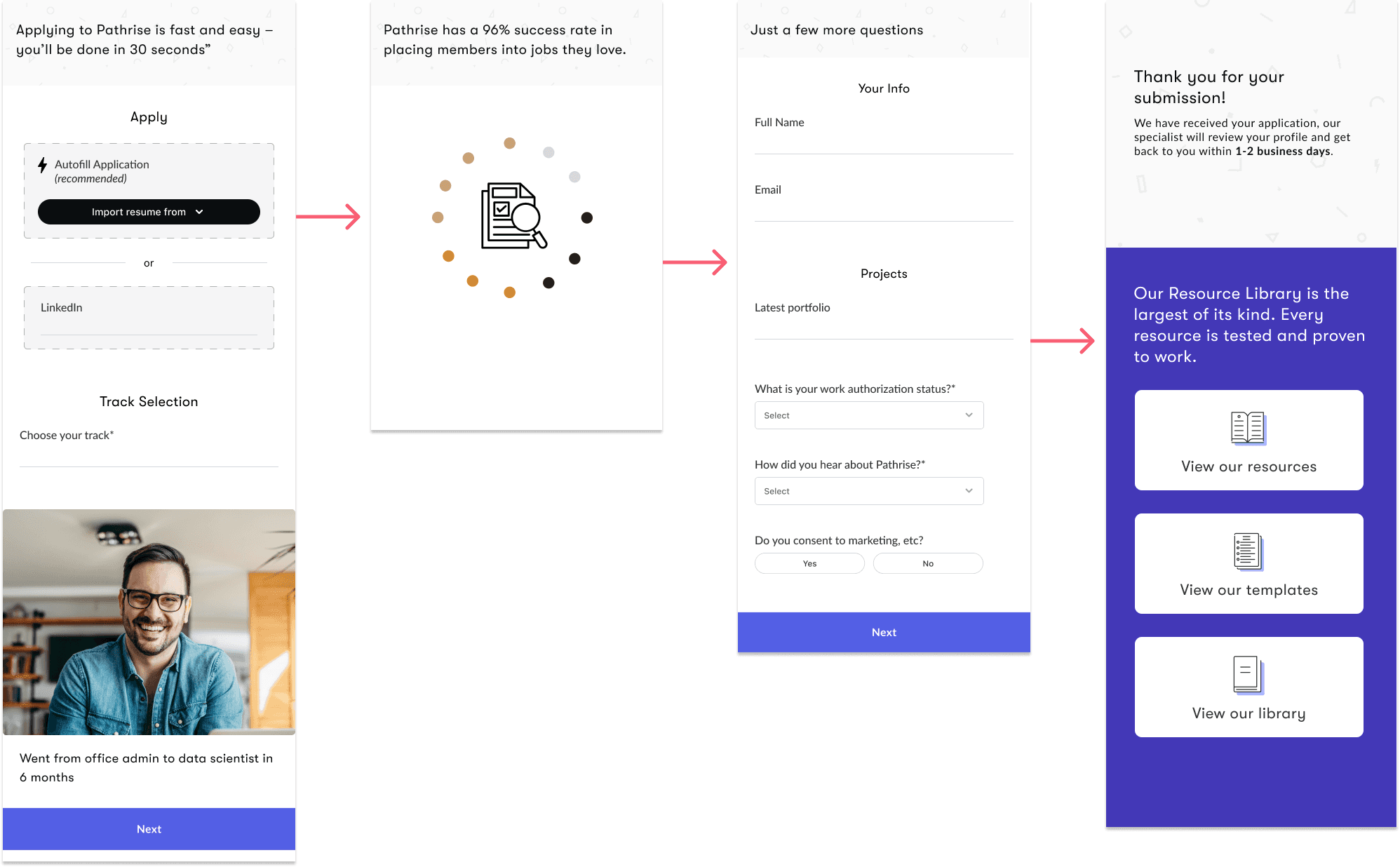
I executed a new enrollment form design and variables for design interactions
We AB tested the form against previous enrollment forms at Pathrise
We improved conversion rates from 45% to 95% with the new design
Enrollment was low and we needed a solution to bring in more students
Our enrollment form had not been updated since mid-2022. Pathrise's overall conversion ratings to join our free trial were around 45%. Our growth team suspected the student enrollment form was part of the problem, and conducted preliminary research to ideate a new design.
Our old design had multiple steps, pages, and unnecessary questions. It also had zero automations. Potential students were abandoning the form due to the requirements to enroll.
Our old design was basic, uninspiring, and required too many manual-fill data points
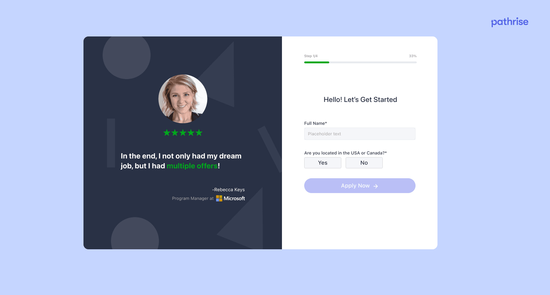


Initial explorations & research led to a simple design with an auto-fill feature
Our growth team completed initial research and I collaborated with the team to define the requirements for a new enrollment form.


I created a mobile experience as well, because many of our submissions were mobile
AB testing results indicated a 95% click-through success rate for prospective students
The AB testing showed the new design was the clear winner, with the new design converting 95%, of users to complete the admissions form, compared to only 45% of users completing the old form.
Shortly after completing the AB test, we launched the new enrollment form. We advised our career and admissions management teams that we would likely receive an influx in signups for the program, and to prepare accordingly.
Our admissions and career teams flexed with the increase in students with support from management
We did see an influx of students wishing to enroll. With strong coaching and training on handling the influx, our team was able to manage the new students and work towards retaining as many new students as possible.
Overall the design was a huge success for the business, and pushed us towards higher enrollment and retention.