Design system and guidelines
Design system and guidelines
This case study is an overview of the design system I created for Salesforce at United Way of Salt Lake
This case study is an overview of the design system I created for Salesforce at United Way of Salt Lake
In May of 2023, I researched and designed the United Way of Salt Lake system design library in Figma from the ground up. As part of the project, I built design guidelines for all Salesforce instances companywide, affecting three teams and the many overarching company functions facilitated by the robust tool.
This design system was part of a larger redesign project for multiple Salesforce instances across the entire company, which I also led. This case study focuses on user research, ideation, information architecture, design, testing, and iteration.
.
TLDR
Defined the problem by conducting user interviews, reviewing previous research, understanding user flows, and testing user's mental models to guide information architecture.
Conducted usability testing and user interviews to gather feedback on design system solutions using a common user instance in Salesforce and completed iterations based on user and developer feedback.
Finalized design system and guidelines, and used guidelines to streamline additional Salesforce instances at the company.
Creating a United front through system design
Creating a United front through system design
Before, our design system was non-existent. There were multiple layouts being used, inconsistent labeling structures, random color selections for the UI and iconography, and workflow rabbit trails running rampant in the user experience.
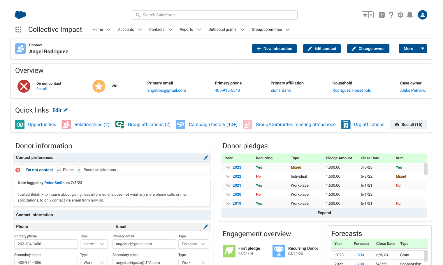
Because there were several dozens of pages and reports being used by the company, I chose to dial down to one specific instance, the contacts page (seen below), in order to narrow my project scope.
This allowed me to conduct research that felt relevant to users while also translating insights from my learnings to the broader Salesforce ecosystem at United Way.
Before, our design system was non-existent, so there were multiple layouts being used, inconsistent labeling structures, random color selections for the UI and iconography, and workflow rabbit trails running rampant in the user experience.
Because there were several dozens of pages and reports being used by the company, I chose to dial down to one specific instance, the contacts page (seen below), in order to narrow my project scope. This allowed me to conduct research that felt relevant to users while also translating insights from my learnings to the broader Salesforce ecosystem at United Way.
The contacts page was the first page I audited, since it was the most universally used by team members at United Way.
There were broken links, irrelevant data fields, badges that no one used, and an overwhelming amount of information.
Auditing the current contacts page
Auditing the current contacts page
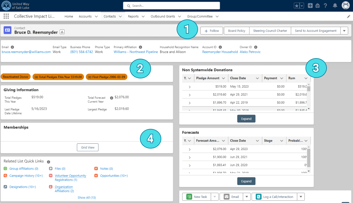
Systems audit
Irrelevant buttons
Badges that no one used
Tables with broken links
Blank objects
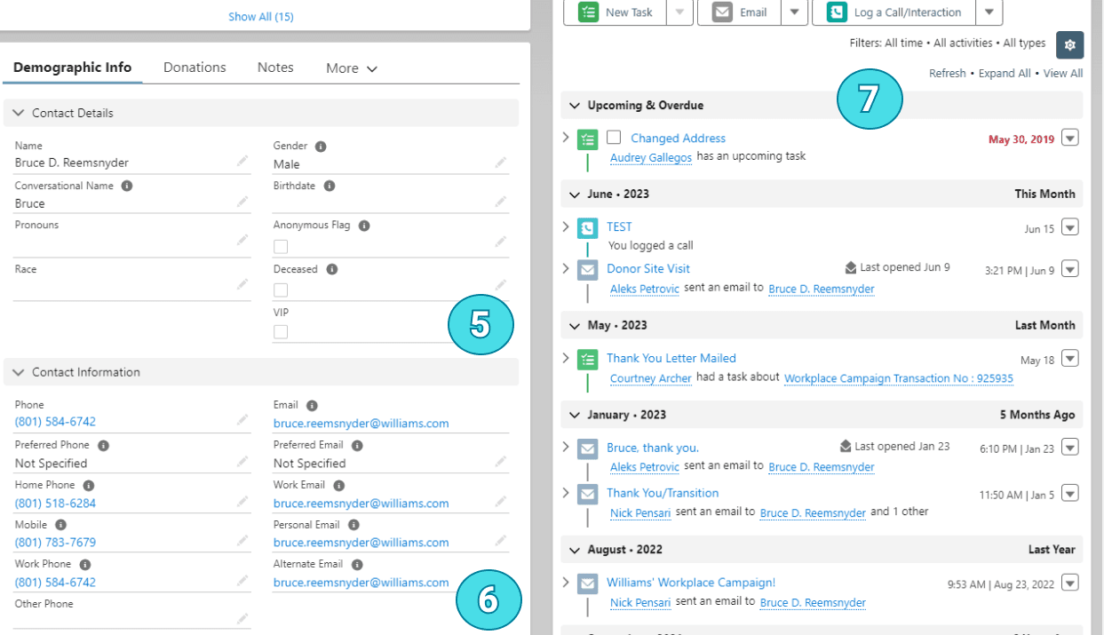
Continued…
5. Fields that were rarely filled
6. Redundant contact fields
7. Filters and links that were not eye catching
Continued…
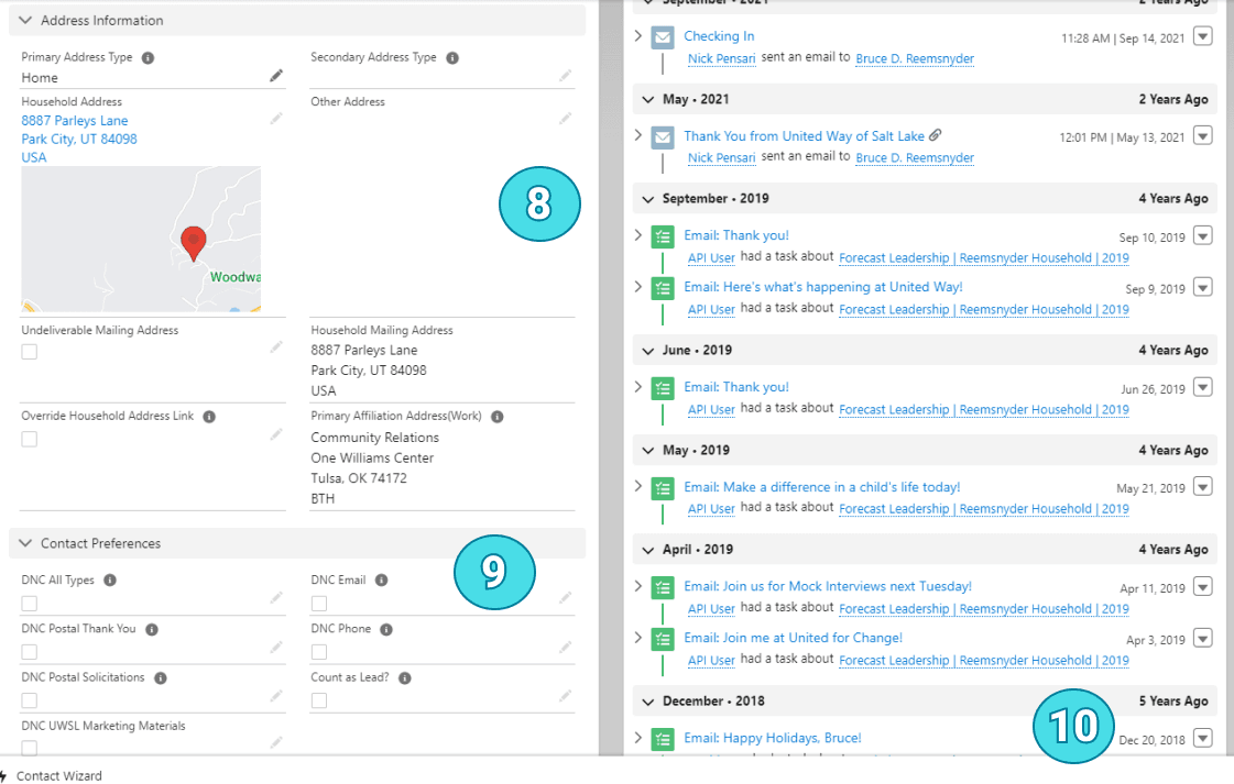
8. Huge real estate for addresses
9. Complicated contact preferences interactions
10. Showing decades of interactions
Initial explorations & research
Initial explorations & research
I spent my first week talking to each team and notating their largest frustrations with Salesforce, their main needs with the tool, and the metrics they wished they could track.
I asked questions like: How do you feel using this tool? What are the main tasks you need to complete in Salesforce? What holds you back from engaging with Salesforce? These are some of my high level findings:
I gathered insights with three separate teams, all using very different Salesforce instances.
It was hard to use. Team members said they would have to click through multiple pages to find basic information.
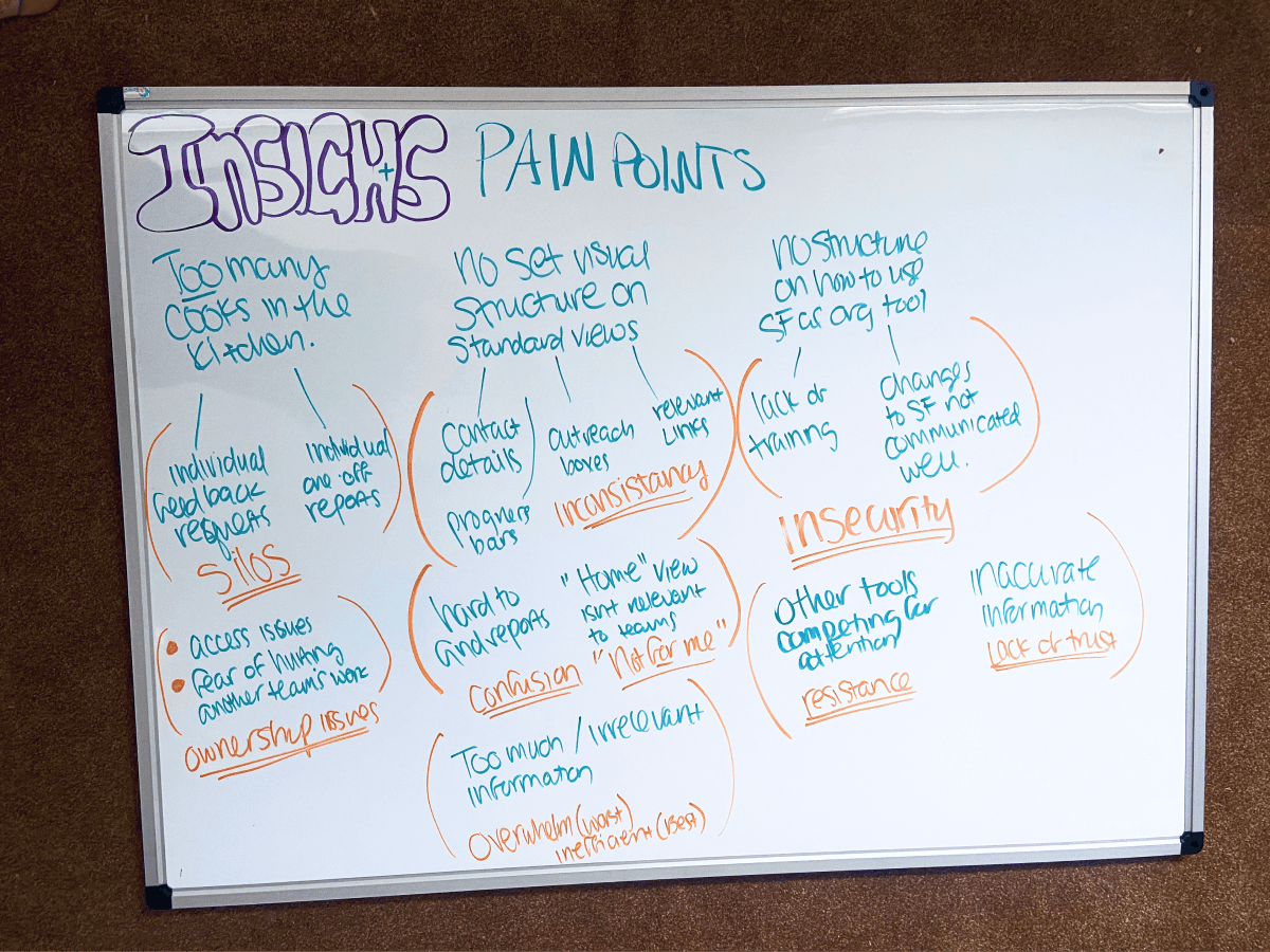
Too many cooks in the kitchen. Each team had very specific requests, but the vision for the company as a whole was lost.
No set structure or standardization. This led to confusion, frustration, and overwhelm when using the tool.
Lack of understanding. The team didn't know how to use Salesforce as an organizational tool.
My goals were to:
Improve user engagement with Salesforce.
Reduce user frustration and confusion when completing standard work tasks.
It was hard to use. Team members said they would have to click through multiple pages to find basic information.
Too many cooks in the kitchen. Each team had very specific requests, but the vision for the company as a whole was lost.
No set structure or standardization. This led to confusion, frustration, and overwhelm when using the tool.
Lack of understanding. The team didn't know how to use Salesforce as an organizational tool.
My goals were to:
Improve user engagement with Salesforce.
Reduce user frustration and confusion when completing standard work tasks.
Initial insights pointed to a design system as a solution to provide structure and standardization to the tool.
In order to establish a scalable design system and guidelines, I conducted user interviews and field studies with three teams at United Way with different job functions.
In order to establish a scalable design system and guidelines, I conducted user interviews and field studies with three teams at United Way with different job functions.
Sitting with team members was really helpful to pick up cues around their frustration, watch them search for basic pieces of data in real time, and see other tools they used alongside Salesforce.
Thomas was on the resource development team, so he needed to know everything about donations made by individual donors and organizations.
.
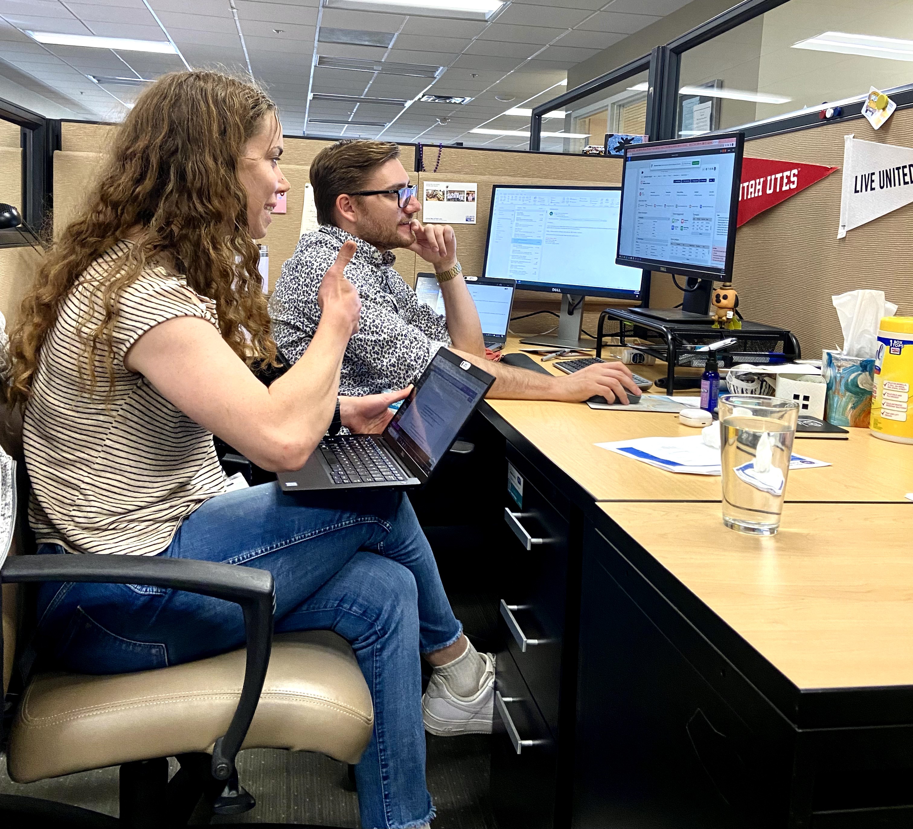
Thomas was on the resource development team, so he needed to know everything about donations made by individual donors and organizations.
Building a system that met the most user needs
Building a system that met the most user needs
I completed 6 field studies with users from three separate teams in order to understand their work flow and the main tasks they needed to complete using the contacts page.
I then created user flows for the top three task requirements for each team while using the contacts page. You can see my user flows for the contact page below, but I also completed user flows for the accounts page and for instances of logging interactions.
Each of these user flows is accompanied by a Loom video gathered during my sessions. This allowed me to go back to view videos as I was designing, as well as be available for future designers and developers.
Each of these user flows is accompanied by a Loom video gathered during my sessions.
Recordings allowed me to go back to view videos as I was designing, as well as be available for future designers and developers.


Understanding our user's mental models and how they naturally want to see information
Understanding our user's mental models and how they naturally want to see information
I conducted information architecture research using card sorting exercises to understand how people naturally categorized the content of each page. All card sorting was open, and I completed three which were supervised and 6 unsupervised. It turned out there were a lot of field items that people had no idea even existed!
I cleaned up the irrelevant fields and inputs and used the insights from the card sorting exercise to name the top three categories of information needs based on the users mental models:
Top three information needs
User interactions
Donor engagement details
Contact information/demographics
.

Did you know you can put on different types of music to set the vibe for your users in FigJam?! So cool.
Once I understood how users categorized and labeled the many fields from the contact page, I got to work doing a more granular audit of each "widget" or section of Salesforce.
I wanted to discover:
highest user needs
Lowest user needs
Fields and/or widgets that could be removed completely.
There were 15 widgets for the contacts page. To conduct this research, I sat with around 8 team members and had them go through each widget telling me high priority needs, outlier items they used on occasion, and items they had no need for. Unsurprisingly, there were many fields and even entire widgets that no one was using.
Did you know you can put on different types of music to set the vibe for your users in FigJam?! So cool.
Once I understood how users categorized and labeled the many fields from the contact page, I got to work doing a more granular audit of each "widget" or section of Salesforce.
I wanted to discover:
highest user needs
Lowest user needs
Fields and/or widgets that could be removed completely
There were 15 widgets for the contacts page. To conduct this research, I sat with around 8 team members and had them go through each widget telling me high priority needs, outlier items they used on occasion, and items they had no need for. Unsurprisingly, there were many fields and even entire widgets that no one was using.

This is how I documented my more granular point research on each widget. I presented my findings to the lead dev once it was completed.

.
Creating layout guidelines informed by my research
Creating layout guidelines informed by my research
The current Salesforce pages had multiple different layout types, and information was found in different places depending on the page being visited.
For example, some pages had a split 50/50 layout, others had a left sidebar layout. Some had related quick links in the side bar, others had them as a full page bar. This made it difficult to know where to find information for users. I set out to choose the best layout option to use across all Salesforce instances.
My cat Fig really loves being involved in white boarding exercises.
.
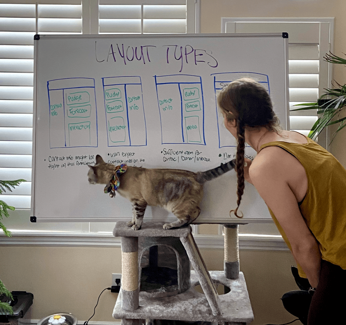
My cat Fig really loves being involved in white boarding exercises.

This was the layout solution.
I chose a 50/50 split layout with the highest need information at the top of the page. From there, contact information would be to the left, all donor engagement information to the right, and interaction history details on lower right.
This would allow the highest priority tasks for the highest number of team members to live above the fold.
I chose a 50/50 split layout with the highest need information at the top of the page. From there, contact information would be to the left, all donor engagement information to the right, and interaction history details on lower right.
This would allow the highest priority tasks for the highest number of team members to live above the fold..
.
Building intentional color systems to lower cognitive load while engaging users
Building intentional color systems to lower cognitive load while engaging users
Previously, we had over 270 different colors to choose from in the standard Lightning Design System color palette. For the color refresh, we wanted to consolidate our color palette, so that each color had a designated meaning.
I met with the head of graphic design to ensure the design system used company branding colors. We looked at multiple color options I outlined, and decided on the United Way dark and light blue as primary and secondary colors.
This was the result
This is only a subsection of colors taken from the Lightning design color pallet. We still had the full color palette range to work with for future projects.
.

This is only a subsection of colors taken from the Lightning design color pallet.
We still had the full color palette range to work with for future projects.

Next to each set of colors, I provided examples of how they would exist within the design.
Instead of colors having no meaning, I assigned designated roles for each color. This was also the first time I addressed accessibility across all the colors in our system.
Color themes
Red was reserved for error states & destructive actions. Previously, it was used in iconography and for accent colors, drawing attention without intention.
Orange was reserved for drawing attention to items needing to be reviewed for the page being worked on. I wanted orange to be used very minimally on each page to draw attention to the most important CTA.
I also created a new vibrant color palette specifically for iconography that used colors outside of the constraints provided by the standard design creation palette.
Icon color themes
Purple for status changes
Green for gifts
Pink for community
Blue for and additional information.

Selecting iconography that actually informs the user
Selecting iconography that truly informs the user
Previously, we had icons all over the place in inconsistent styles, and icons which did not fit the item they were associated with. This caused confusion with our users, because most icons were unceremoniously selected, and at times warning or stop colors were used (like red and orange) that drew attention to icons that did not require caution.
In this project, I selected a set of pixel-aligned icons that would work for most use cases across United Way of Salt Lake. Every icon was either 16x16, 20x20, 32x32, or 44x44, depending on the use case.
.


The main instances for iconography were quick links and tags, which you can see here.
We already had a full list of icon buttons to work with through the SF Lightning design system.
Building out button hierarchies and defining use cases for primary, secondary, and tertiary
The main instances for iconography were quick links and tags, which you can see here.
We already had a full list of icon buttons to work with through the SF Lightning design system.
Building out button hierarchies and defining use cases for primary, secondary, and tertiary
I created a custom set of primary, secondary and tertiary buttons using the United Way of Salt Lake brand colors. I indicated primary buttons would always be used for executive functions of the page, secondary for expansion options, and tertiary for adding new details to existing information. Usability tests with users indicated these buttons pulled attention consistently.
I created a custom set of primary, secondary and tertiary buttons using the United Way of Salt Lake brand colors. I indicated primary buttons would always be used for executive functions of the page, secondary for expansion options, and tertiary for adding new details to existing information. Usability tests with users indicated these buttons pulled attention consistently.
The buttons use the primary and secondary United Way branded colors.
.

The buttons use the primary and secondary United Way branded colors.
Putting the system to work!
Putting the system to work!
With the contacts page as my foundation for the design guidelines, I set to work testing the system I created. There were three main iterations I completed for this page, which led to strengthening the design system overall.
This is one of the first iterations.
.

Usability tests and gathering feedback
Usability tests and gathering feedback
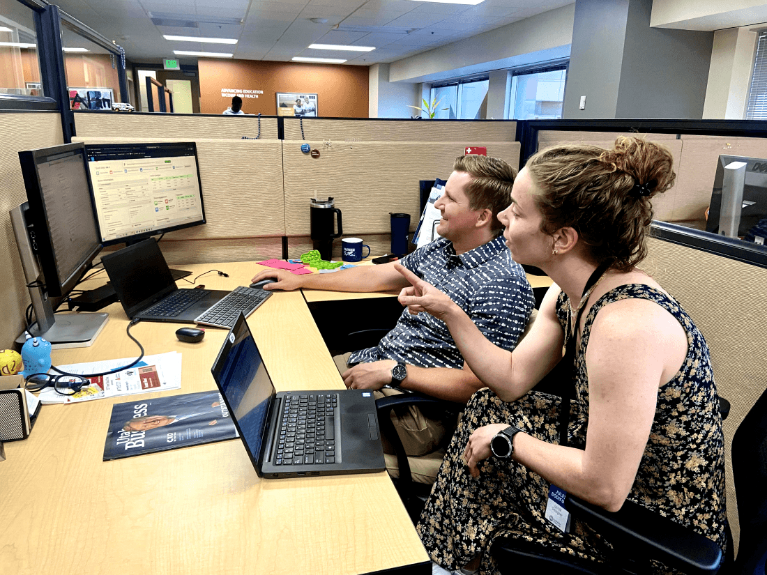
Here I'm chatting with Alan about the new design. This was one of 6 usability tests I completed.
I conducted 6 usability tests and 4 accessibility user interviews with the design to determine the usability of the contacts page and the overall design system.
I conducted 6 usability tests to determine the usability of the contacts page and the overall design system. I made many changes based on the feedback provided, and found several elements of the page required more thoughtful solutions. This was an entire side quest that I'll get into with a later case study.
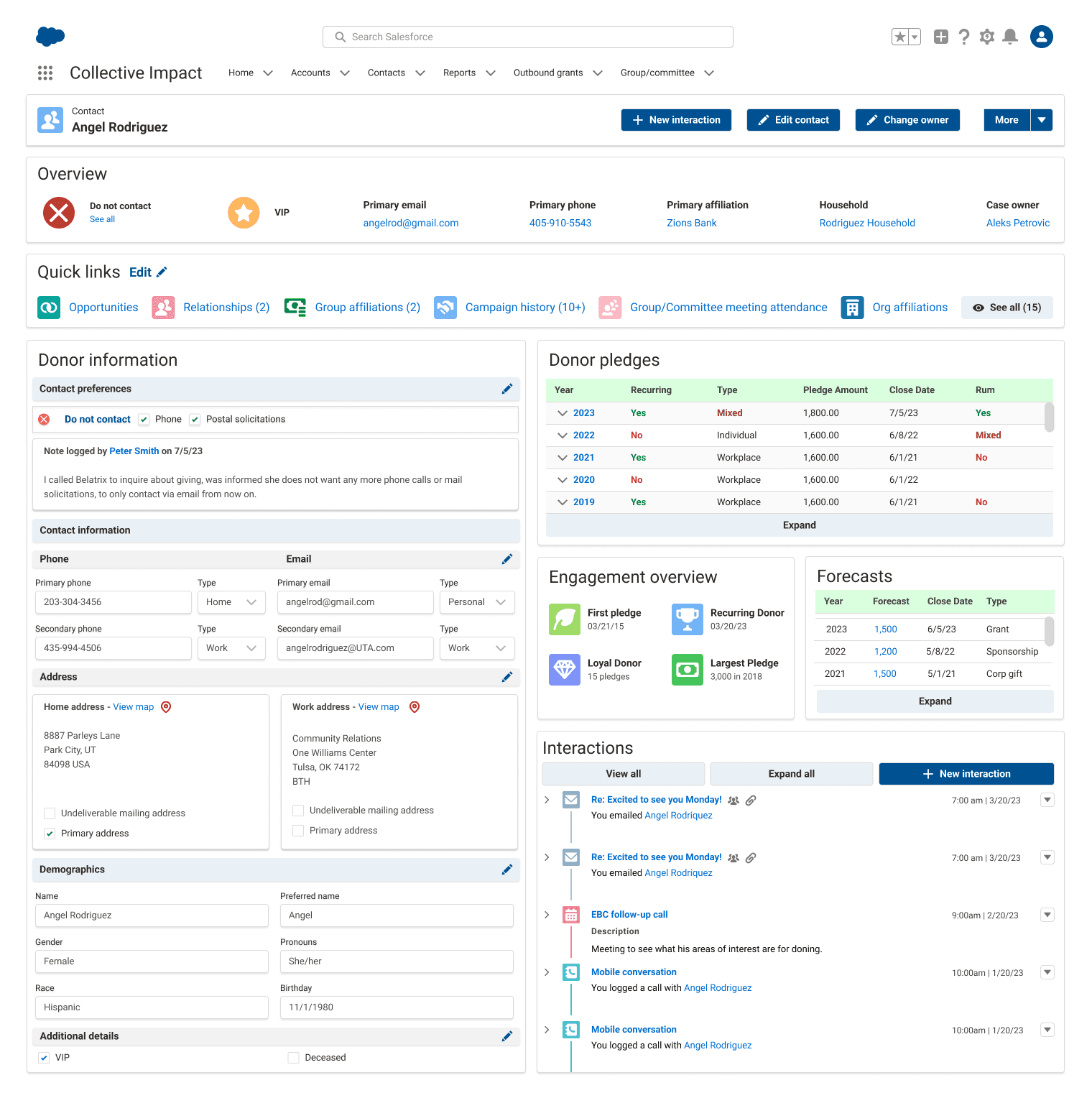
However, the final design with all feedback and solutions implemented is below.
You can see my full iteration set here.
You can see my full solutions required page here.
.
Solving design problems
Solving design problems
Pledges and forecasts
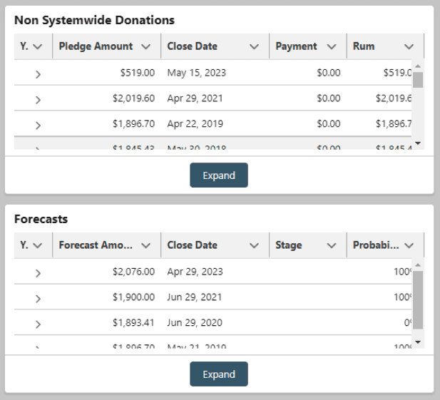
The old design had broken links, bad UI, and was difficult to read.
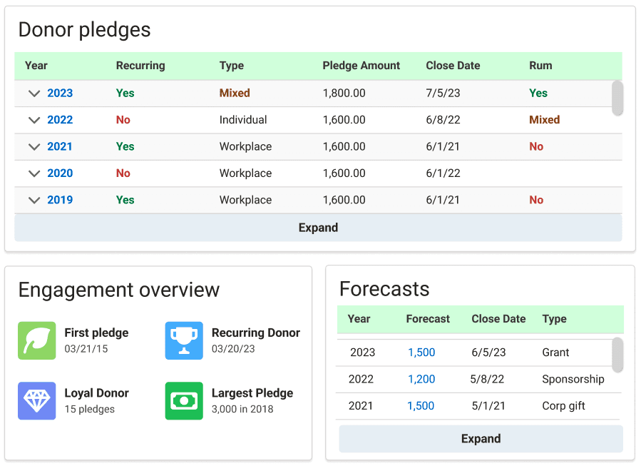
The new design created space for more relevant information, fixed the broken link issue, and showcased information based on importance to users.
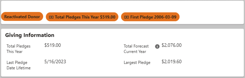
Contact preferences
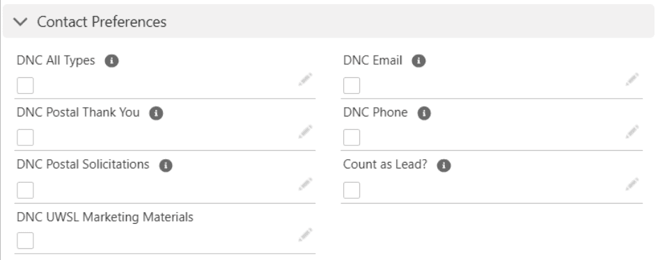
The old design lived at the bottom of the page even though it was high priority for users, and was difficult to edit.
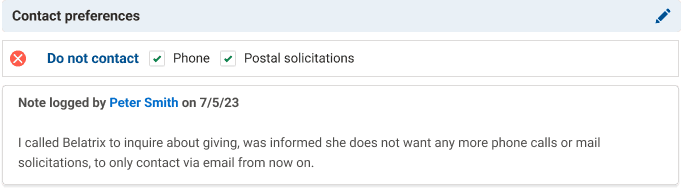
The new design provided a badge in the contact overview to see preferences easily (below), and made updating preferences simple for users.

Donor engagement overview
The old design showcased unimportant information and was housed in a location that didn't make sense to users.
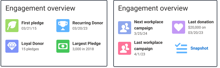
The new design housed relevant information for each unique page and lived right next to pledges and forecasts.
I conducted 6 usability tests to determine the usability of the contacts page and the overall design system. I made many changes based on the feedback provided, and found several elements of the page required more thoughtful solutions. This was an entire side quest that I'll get into with a later case study.
However, the final design with all feedback and solutions implemented is below.
You can see my full iteration set here.
You can see my full solutions required page here.
.
Measuring success by our ability to provide an intuitive system
Measuring success by our ability to provide an intuitive system
This project is still in progress, so metrics like adoption and engagement are tentative. However, based on user surveys, we received the following feedback:
Users stated the new design system was more clear, concise, and visually appealing.
Users stated they were able to complete their highest priority tasks more efficiently with the new design.
Users felt more confident when gathering information with the new design.
Users felt more comfortable making edits to information on the new design.
My favorite success for this project was really seeing first hand the excitement users felt for the new Salesforce view!
My favorite success for this project was really seeing first hand the excitement users felt for the new Salesforce view!
The importance of communication and navigating multiple team's needs
The importance of communication and navigating multiple team's needs
One thing I didn’t expect was the fact that working for multiple teams made me feel pulled in many different directions at times. I made sure I provided myself a Northstar by understanding the most common goals of our users as well as the power users of the system I was working on so I could provide the most value to the most users.
I also accidentally did my field studies with users to define main user flows without recording the conversations or screens of the users. I’ll always record user flow related meetings in the future so I can review them for more granular details as needed.
Nerd alert!
Hello Web Design by Tracy Osborn and Design Systems Handbook by Marco Suarez et al helped me a ton for this project!
Nerd alert!
Hello Web Design by Tracy Osborn and Design Systems Handbook by Marco Suarez et al helped me a ton for this project!
The continued dream for United Way
The continued dream for United Way
My next goal with this project is to continue building out solutions around user to donor interactions, like sending emails, making calls, and streamlining those processes to make them easier for users. I would also like to have design systems in place for forms and work requests within the Salesforce ecosystem.
.