This was a 3 month-long project where we built out a feature to make our two week trial more clear for students. The team consisted of myself, our product manager, and our engineering team. This case study focuses on user research, ideation, design, testing, and iteration.

.

TLDR

  • Defined the problem by conducting user interviews and competitive analysis.

  • Built system requirements, wireframes, and high fidelity prototypes.

  • Conducted usability testing and user interviews to gather feedback.

  • Completed iterations on design feedback for implementation.

  • Feature reduced student confusion and improved retention.

Our students were confused, overwhelmed, and were not signing up for the full program

Our two-week free trial at Pathrise was one of our largest selling points. During the trial, students had access to career coaches, mentors for their industry, workshops to build their resume and LinkedIn, as well as countless resources to use to aid their job search. However, we were still losing students after the trial.


During the research effort to dig into our retention problem, we found that students felt confused and overwhelmed during their trial. I was tasked to create a syllabus feature to help solve for confusion and improve retention.


Auditing the current system showcased issues of information overload and deep inconsistencies

In the first image, you can see the notes section. There were tasks due each week as well as verbal and written reminders made in notes for each student.

The second image shows our student's schedules with their workshops and meetings. Students also received to-dos via email and multiple other places.

The notes section was one of many inputs our students had. There were tasks due each week as well as verbal and written reminders made in notes for each student.

We also had a schedule with their workshops and meetings, shown here. These meetings were also housed in Google Cal.


Students also received to-dos via email and multiple other places.

Initial explorations & research

I conducted user interviews with students who were a) currently in the free trial, b) had just completed the free trial and signed up, and c) had finished the free trial without signing up.


We asked questions like: Did you know what you needed to do each week? How did you feel when working through your tasks? These are some of our high level findings:

.

  • Overwhelm. Students were receiving input from many different places and were reviewing their calendar, the platform, emails, and their written notes to stay organized.

  • Confusion. Our students were constantly seeking the next piece of information needed to move through the trial.

  • Engagement. Because students weren't bought in to the program yet, engagement dropped off when they felt frustrated or couldn't figure out what to do next.

  • Overwhelm. Career mentors felt overwhelmed by the countless process documents they had to gather tasks from.

  • Engagement. Some mentors were more engaged with setting goals and using the internal platform to log goals than others (this became a fun side quest!)

  • Lack of time. Mentors forgot to log tasks because our sessions were only 20 minutes long.


Here, Elsie was showing me how she assigned tasks for a student during their free trial. All task assignments during the trial were manual at this point.

Here, Elsie was showing me how she assigned tasks for a student during their free trial. All task assignments during the trial were manual at this point.

I also gathered feedback from our mentors, who felt equally frustrated with the lack of organization during the trial I compiled the multiple user interviews with both students and fellows into these insight themes.

I also gathered feedback from our mentors, who felt equally frustrated with the lack of organization during the trial. I compiled the multiple user interviews with both students and fellows into these insight themes.


I completed an empathy map as well, since I got so many good quotes and feelings from our students while researching this problem. Here are a few themes that came out of the mapping exercise.

.

I completed an empathy map as well, since I got so many good quotes and feelings from our students while researching this problem. Here are a few themes that came out of the mapping exercise.

Building system requirements for multiple industries involved heavy collaboration and understanding greatest user needs

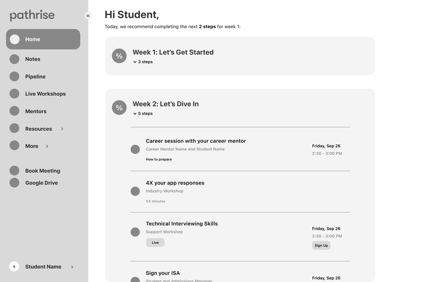
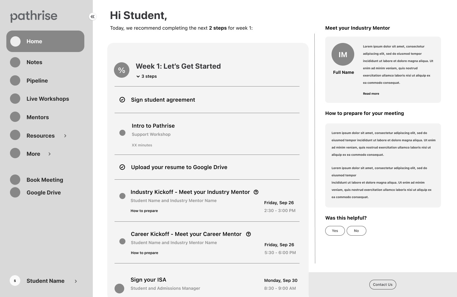
I developed a 2-week trial experience for students in 6 different industries, all of which had their own unique needs. There were several tool integrations I had to take into account, like scheduling in Calendly or uploading docs to google drive.


The five main information types were

  • Upcoming sessions

  • Resources to review

  • Group workshop sessions

  • Tasks to complete each week

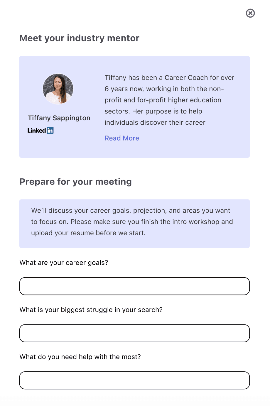
  • Contract signature requirements

.

My cat, Fig, loves doing research as much as I do.

Reviewing other systems and tools for syllabuses and trials showcased multiple design options

My cat, Fig, loves doing research as much as I do.


Getting inspired

I researched other syllabus type guides to make sure I was on track, reviewing Udemy, Coursera, and various bootcamp syllabuses. I also took inspiration from Turbo Tax's linear step by step tax filing process (it was tax season, y'all) and bill summaries from different banking institutions.

Testing wireframes with stakeholders helped prepare us for high fidelity design creation

I created wireframes to present to my product manager and senior designer. I created a collapsible weekly syllabus which incorporated everything our students would need to successfully complete their trial. I also included small FAQs in the design, since many of the questions I received from students during their trial were questions about how different mentors could help them or what they could expect from meetings and workshops.

I created wireframes to present to my product manager and senior designer. I created a collapsible weekly syllabus which incorporated everything our students would need to successfully complete their trial. I also included small FAQs in the design, since many of the questions I received from students during their trial were questions about how different mentors could help them or what they could expect from meetings and workshops.


The wireframes included

  • Small FAQs

  • A weekly breakdown for the trial


.

.

.

Testing high fidelity designs showcased even more information needs from students to make the product a viable solution

After gathering feedback from key stakeholders, I created high fidelity designs in Figma and tested them with users 6 student users.


During the test, I asked task questions with our users and timed their responses. The design was sound in usability tests, but there were key pieces of feedback I received that changed the direction of the design. Our users wanted even more clarity and information added, so it could be more like a one-stop-shop to complete their trial needs, instead of looking like a printed off syllabus with only a few interactions available to them.


Additional feature requests

  • Options to download PDF of contracts

  • Ability to go straight to Google Drive from the syllabus

  • Automatic recording downloads into syllabus after sessions

  • Timezones and lengths of time for sessions

  • Links to live workshops


V1 of our week one view included options to check off tasks as they were completed as well as FAQs to answer questions our students had during my initial research. I chose to do a collapsible design so that week one could be collapsed after completion.

Our users were excited to have information in front of them, finally. But they also wanted it to be a one stop shop.

V1 of our week one view included options to check off tasks as they were completed as well as FAQs to answer questions our students had during my initial research.

I chose to do a collapsible design so that week one could be collapsed after completion.

There were technical constraints to be solved and additional testing to be done for next iterations

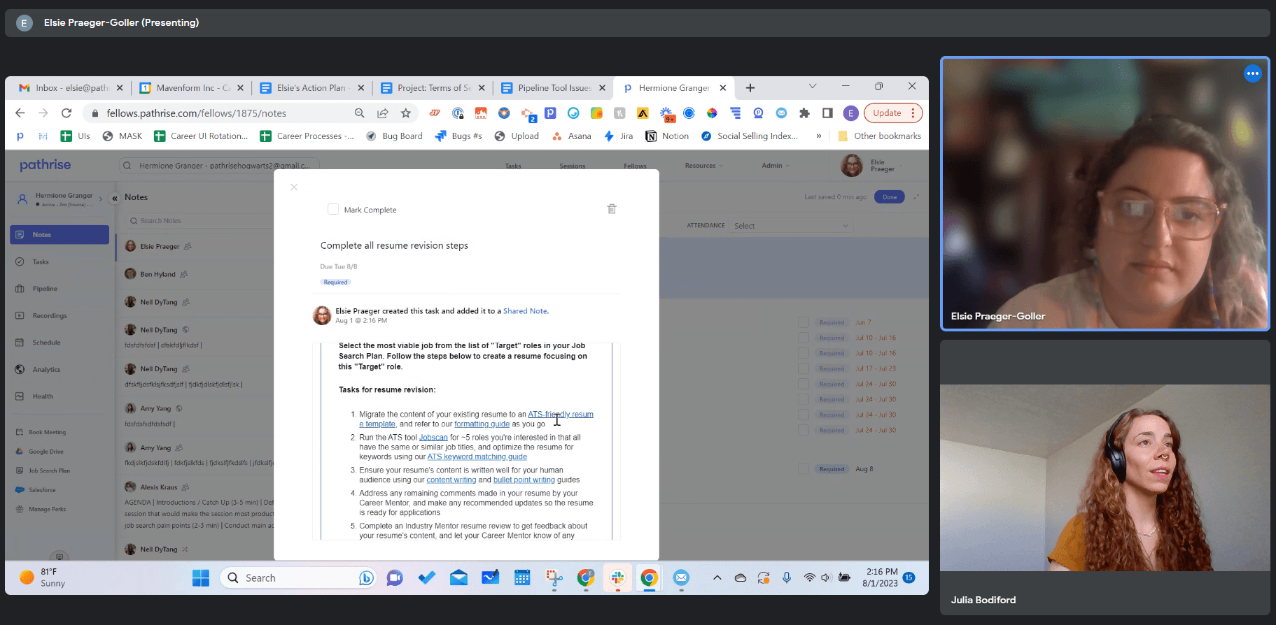
When I presented next steps with the design to engineering and the product team, a technical constraint came up. We were wanting to track our student's task completion automatically, but when it came to uploading their resume and watching workshops, we couldn't verify on the backend that the tasks had actually been done.


Ultimately, my solution was to create a manual check off so that students could say they completed those tasks. While not 100% accurate, we decided to use the honor system with those tasks. I tested the new check boxes with a couple users to make sure it was clear the items needed to be checked off during the trial.

.

Receiving a design critique with our Senior Designer, Hilary.

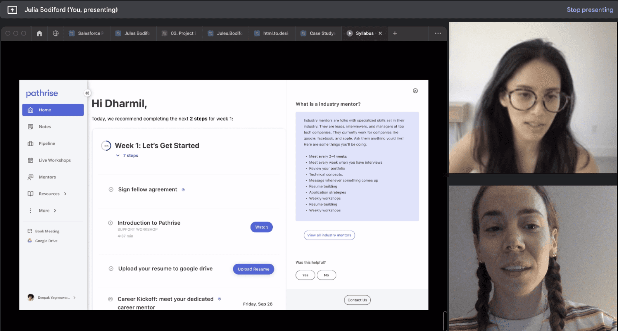
We chose to take the product live with a beta test so we could keep a close eye on any issues

We beta tested the syllabus feature with our software engineering students first, gathering feedback, and iterating once more before going live across the entire program.


We had multiple career mentors over the software students, and we included them in the beta process, asking them to touch base with students in the free trial to collect any feedback or issues that came up for them. If issues arose, they were asked to connect with me directly. I also chatted with the mentors at several touch points over the next couple weeks to gather feedback.


I conducted user interviews with multiple students involved in the beta test, and received glowing reviews. Our users described the trial as being very clear, and said they found it easy to understand what to do next. Users were also using the FAQ icons to learn more about their mentors and workshops. This was a huge win for our team.

.

V2 and rollout to the entire program

In our V2, I made multiple improvements based on the feedback and usability sessions I had with students, as well as the feedback I collected from mentors who were involved in the beta project.


Additional design upgrades

  • Rescheduling options inside the syllabus

  • Providing more focused information under "Who are industry mentors" and "How do they work with me?"

  • Imbedding a "How to prepare" button with optional prep questions so that students felt more prepared

In our V2, I made multiple improvements based on the feedback and usability sessions I had with students.


Additional design upgrades

  • Automated integrations to download PDFs, view Google Drive, and view previous recordings cut down on back and forth between career mentors and students.

  • Adding time zones, length of time expected for meetings, and the ability to reschedule lowered student's meeting no-shows and improved student to mentor communication.

  • Having an explanation of their coach, a link to their

    LinkedIn, and prep questions helped students feel more prepared for their meetings.

.

Automated integrations to download PDFs, view Google Drive, and view previous recordings cut down on back and forth between career mentors and students.

Adding time zones, length of time expected for meetings, and the ability to reschedule lowered student's meeting no-shows and improved student to mentor communication.

Having an explaination of their coach, a link to their LinkedIn, and prep questions helped students feel more prepared for their meetings.

Engagement with the syllabus exceeded expectations and followup interviews showed we solved for free trial confusion

  • 46% of students clicked on the program intro video, exceeding our goal by 6%.

  • Students also interacted with elements lower on the page, such as "How to prepare" and "Who are industry mentors?".

  • 80% of Students answered "strongly agree" that the syllabus made their trial feel very structured.

  • 80 % of students answered "strongly agree" that they knew what to do each week for the trial.


Tracking retention of students was complex because there were many moving parts for that metric. However, we did note that retention improved by 4% in the coming months after the syllabus was launched.


Below is the final design!

46% of students clicked on the program intro video, exceeding our goal by 6%.

  • Students also interacted with elements lower on the page, such as "How to prepare" and "Who are industry mentors?".

  • 80% of Students answered "strongly agree" that the syllabus made their trial feel very structured.

  • 80 % of students answered "strongly agree" that they knew what to do each week for the trial.

  • Career mentor managers also said reports from Career mentors that their students were confused went down dramatically.


Tracking retention of students was complex because there were many moving parts for that metric. However, we did note that retention improved by 4% in the coming months after the syllabus was launched.


The final design :)

Career mentor managers also said reports from Career mentors that their students were confused went down dramatically.

The syllabus feature was our first success before diving into a full task management system

The syllabus was the first project of several aimed to overhaul our internal task management system at Pathrise for both students and career mentors. The next big push would be a task management feature, which I also worked on!